
Intro
When I was challenged to take a portion of the Instagram app and rethink and redesign it. It threw me for a loop. I often think of different things in apps that I like or don't like. Transitions, app design, behaviours. The way you upload a photo, post an update, tag a location. What I don't often do is get around to being pro-active about flushing out my ideas. Sometimes they end up in sketches. Other times their initial thinking make their way into a dribbble shot or even into a client project.
The rest of this page is a collection of thoughts, sketches and semi-tight comps. My goal was to help show how I work. What I thought about and why I did what. This is a beginning of a larger conversation. I hope it continues...
Process
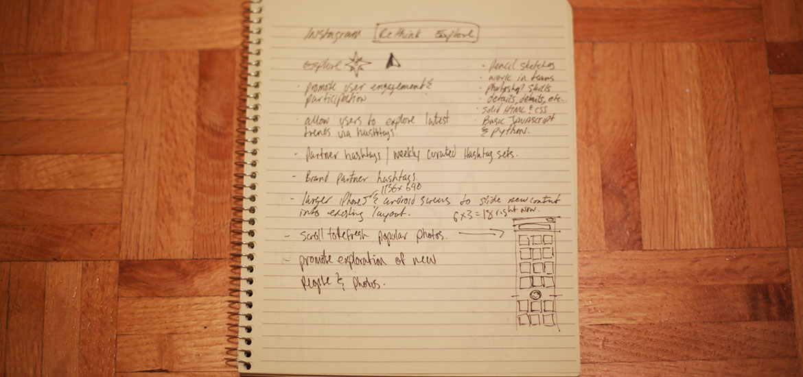
With this project I followed a process I've done for many many years. Sketching. I often find sketching a great way to get ideas out. For this project I spent some spare time getting a screw taken out of my cars tire (second one in 3 weeks ugh...) sketching on my daughters iPad with the paper app (thanks em!) I followed up with a bunch of sketches and notes in a pad at home. Since I don't have a whiteboard at home I was reduced to paper and the iPad. But often if I can get myself in front of a large whiteboard I love to sketch big and standing up. Even better is sketching with people on the same project as me as I'm a fond believer in collaboration within projects. Below are the sketches I captured in the beginning stages of this project.
Sketches
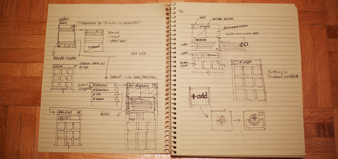
These are some of the sketches I made in the early stages and throughout my tinkering with this idea. While the ink ones have been photographed. I did some on the iPad with the paper app. Click here to view the Paper app sketches in PDF.
Wireframes
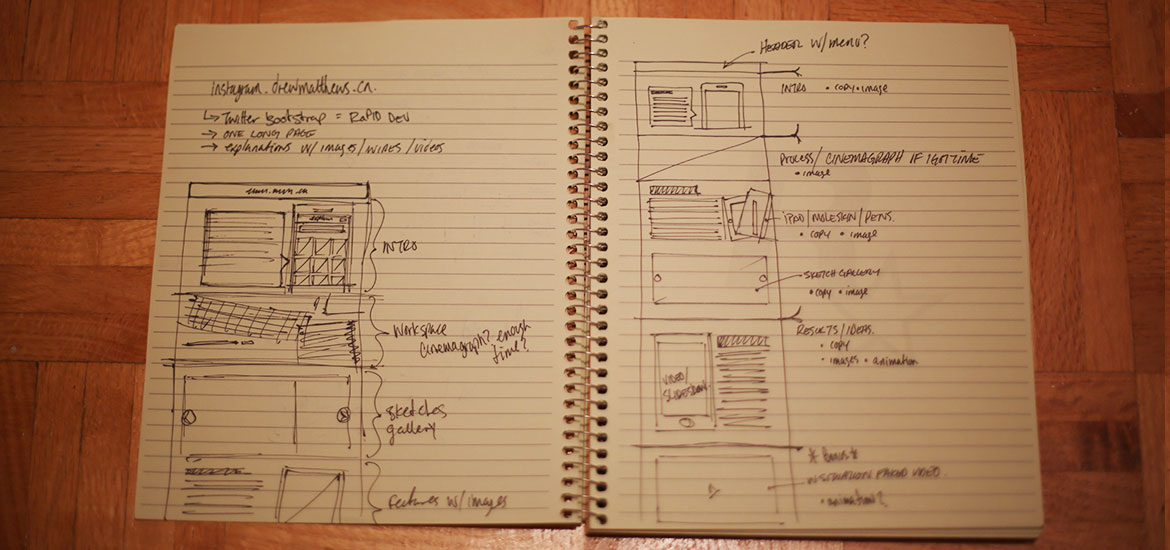
These are some cleaned up wireframes from the original sketches. I've been making my own wireframes to varying degrees in Illustrator for a few years and have settled on a style that often works for me and the agency life I lead. Truthfully in the agency world wireframing and user flows aren't that common in most of the places I've worked in 12 years. These are a culmination of personal experience and the interactions I've had with friends during my career.
Wireframes are on their way, they got lost in the shuffle and the busyness of my day job. Rest assured they will find their way to this section of the project for your viewing pleasure shortly. Thanks for understanding.
Ideas
I settled on the Explore tab within Instagram since I felt it was an area that could use some reinvention. When I picked this area to explore I did so with a few points in mind that I thought might be intriguing to users.
- promote engagement/exploration: I've often turned to the explore tab when I've exhausted my stream. Now don't get me wrong I've found a few people to follow from the explore tab. But often I find its a repository for one direction photos and celebrities. Both of which have found their place amongst Instagram. But optionally seeing whats trending with hashtags rather than just being popular could open up a new stream of up to the second content.
- hashtag pulse: much in the same way hashtags trend on twitter I'm sure that they can and do trend on Instagram. If I had a way of browsing those active tags I could dip into streams of content I may have missed by not knowing a specific tag
- Instagram weekly hashtag project: I actually really love this project and if I happen to spot an update in my stream I usually dive in. But I know that not everybody may follow Instagram on Instagram (swear I'm this close to an Xzibit joke) so a way to showcase these could be really neat.
- Partner Content: I know that brands are on Instagram. I think its awesome. It's exactly the type of content I want from the brands that are important to me. If a brand I follow on Instagram is actively using a specific hashtag could I be shown that content as a set? that would be rad.
- Events: Slight play on Partner Content but you get the idea. World Cup, Olympics, Orange October. Events at a world scale where people are capturing those moments for all to enjoy
- Offer a unique way to add to each event stream: It's one thing to have access to great streams of content. To follow people. But to jump right into and add to these streams is just as important.
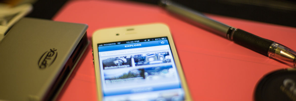
Explore - Home
The new Explore home screen currently shows off two different featured "sets" of photos. Each of these sets is powered by user hashtags. In one case we have the Weekly Hashtag Project featured. We know this is a stream curated by Instagram since its icon is associated with the hashtag. The images in these stream boxes are directly from the sets of photos. These would be updated as new photos get added. Optionally you have the ability to see "More". Users pressing on the more button will have the next streams push the page south to display those streams.
While hashtag powered streams have take the more prominent space in the upper portion of the screen. popular photos get their own division and appear further down. While space may seem slightly limited in this example. New larger screens will allow for more of the popular grid to peek up from the bottom. (i'm still waiting for my iPhone 5 to arrive)


A dip in the stream
If a user dips into a hashtag stream, say the #WHPgreatheights tag. We slide to the right and see the Stream Explore screen. This screen shows everything to do with this weekend hashtag project. You'll notice that the upper photo mosaic contains some of the images found within the stream. THese will slide to the left ever so slightly constantly revealing and hiding images in the background. You can swipe the info panels to the left to reveal more information about the project.
Swipe up and scroll through the stream of photos with this hash tag. You can use the familiar view controller to see grid, list or map views of photos in this stream. This stream is a continuous updating stream. When you reach the end of the loaded content you'll get more by scrolling south. This is nothing new but still a habit I love in apps ;)
Snap, tag, done.
At the top of the image thumbnail stream you'll see the top left-most box isn't a photo but rather a plus icon. This lets users add to this particular hashtag steam. This plus icon launches the camera, allows a person to select or take a photo in the same familiar manner they are used to. Upon completion their photo will have that streams hashtag auto tagged to the image. Adding it to the steam.
The ability to view and then immediately participate in the stream is whats really intriguing to me. Blending this new consumption method with the familiarity of taking photos and posting them is really a neat gesture to me. You can turn passive viewers into active participants.


Hi! this project and site were built by Drew with a little help from Twitter bootstrap ;)
I'm a designer, technologist and motion graphics operator from Toronto Canada. I'm currently attempting to make a life and career pivot. Leaving the digital agency life and moving my family to San Francisco. In the hopes that I can build and create products and experiences that are meaningful and helpful to peoples lives.
Read more about my life/career pivot here. Get back to my site by clicking this. Don't forget you can always reach me via email.
Change log.
- Sept 29, 2012
- First publish.